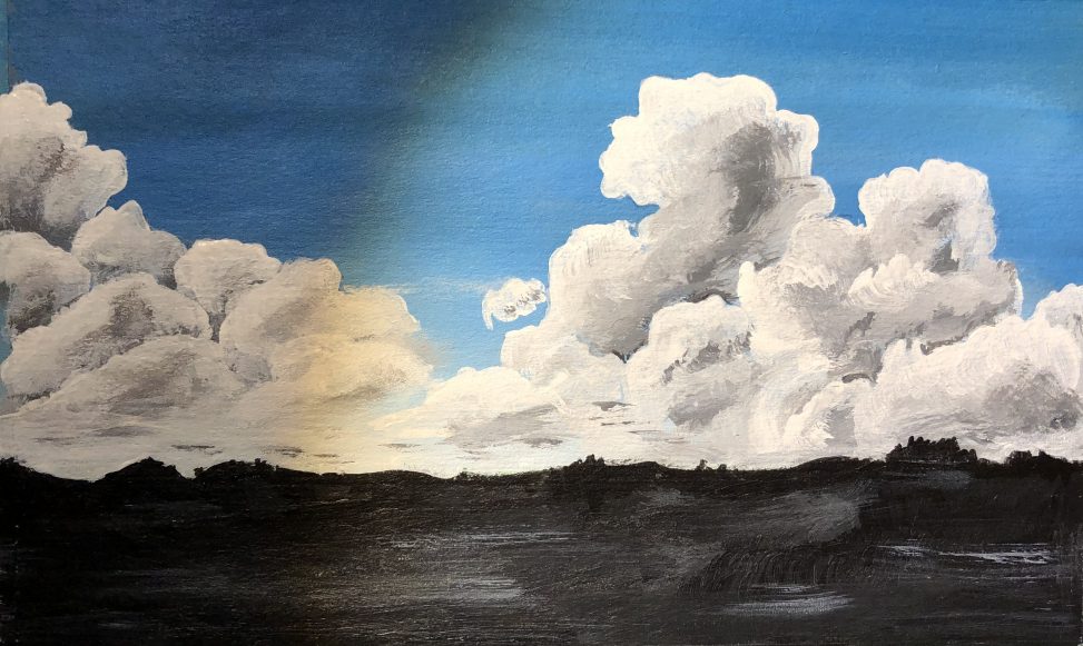
I painted this one on the cardboard back of a discarded small notepad. The goal was to work on blending (background). For the clouds I was trying to make them more cloud like and to blend them more smoothly. I also wanted more dark/light shades in the clouds.
RATING: 4.0
VERDICT: Still need improvement. The larger cloud (right center) is best. Other areas look like I skipped blending altogether. I did not do Felix’s blending technique where he goes over almost dry paint with a fine mop brush to soft blend. I may need to try a photo of clouds where I can paint and shade to a realistic cloud instead of something made up. I also should have left more of a gap between the black ground and the clouds. Some blue between would have made the clouds stand out more.
Comments are closed.